How I Built My Maximalist Art Studio
Sema Martin | 9th January 2023
As long as I can remember, I have been in love with colour. Colour, pattern and vibrancy have been at the heart of my fashion and artistic choices. Colour is a part of who I am and how I express myself. Why then did my art studio not reflect this?
Since deciding to take my art more seriously 7 years ago I have had a number of different studios. Each iteration reflected a different time in my life. My first work space consisted of a small glass table ( with a light underneath to use for tracing) and a window sill lined neatly with glass jars full of coloured pencils. A wooden drawing board formed the work surface itself, and that was about the extent of my set up. It was about as impersonal as it could get, but that wasn’t what it was about. It was a statement of my decision to begin life as a working artist, and for that it did the job.
Following a series of house moves, various iterations followed and my equipment was slowly upgraded. A new lamp here, a set of drawers there. This was all about functionality. As my art business grew I needed more kit, and I added it in as coherently as possible.
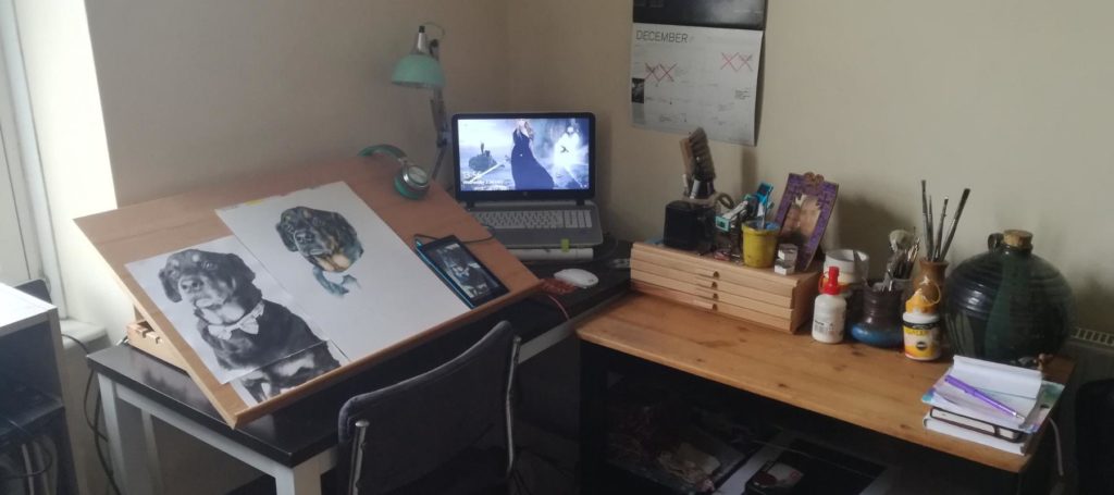
However, each time I redesigned my workspace something was always missing. Yes, it was clean, contemporary and functional, the basis for any good work space, but it lacked something. As an artist, you want to spend as much time as possible creating art, and sometimes your workspace gets neglected as a result. The result of this is a space that becomes stagnant, generic and uninspiring.
What I needed was a fundamental change to the way I worked and the way I expressed myself as an artist. How can I create in a space that feels uncreative? The space needed to empower me and my art, to inspire my creativity and nourish my soul as an artist.
I knew deep down that maximalism held the answer and I set about creating the maximalist art studio of my dreams.
What is Maximalism?
You may find yourself asking “What even is maximalism?”. At first I didn’t have the words to explain the look I wanted, I just knew that I wanted it colourful, eclectic, vibrant and interesting. It was when browsing interior design magazines that I discovered the world of maximalism and immediately knew it was the way forward. Maximalism is an interior design style that developed as a reaction to the stark, cold, clinical interiors popular with minimalism. It has its roots its Victorian styles, where collecting, detail and excess were popular, but has developed into an eclectic mix of eras, colours and design styles. Think more is more. More bold colours, more pattern, more beautiful objects and fabrics. That is what maximalism is about. Beyond that there aren’t any rules, you are free to mix it up. This all really appealed to me as an artist.
Lets Talk Desks
Any studio needs work spaces and being a coloured pencil artist I needed a drawing board and desk space. Drawing boards come in lots of different types, and I already had a basic drawing board desk as a starting point. This was great as is has some storage shelves at the size, a 60cm x 80cm drawing board that sits at lots of angles and a flat section I can use to put my pencils on while I work.
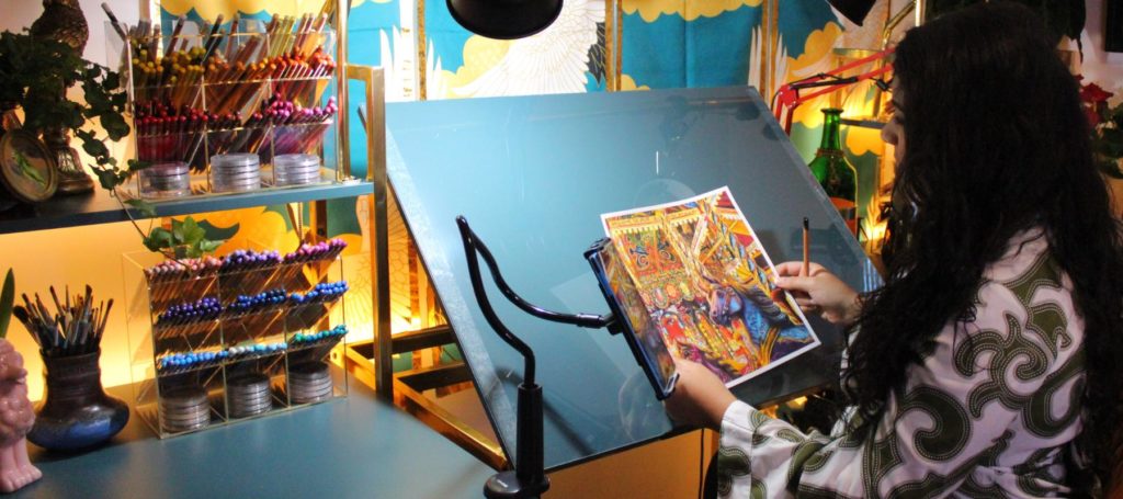
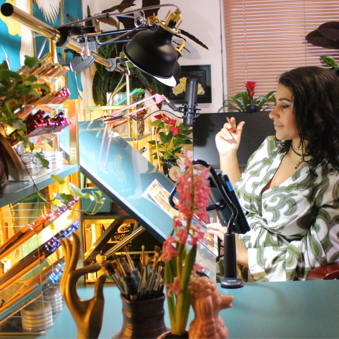
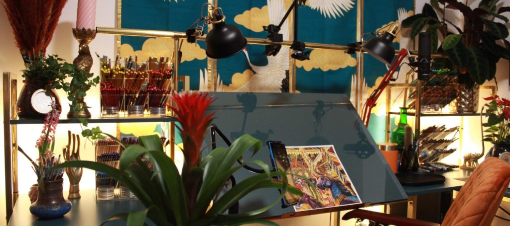
What worked less well for me was the colour. I had a vision of having a gold framed desk with blue or green surfaces. The darker surfaces would contrast well with my drawings in photographs, and the gold frames would add some luster to my work space. The problem was, the desk I had designed in my head was very expensive to buy new, so I got busy with some self adhesive vinyl and transformed the desk I had. The addition of two similar tables (again recovered in vinyl to match) created a horseshoe shaped work area that gives me a dedicated space for my computer, my drawing and packing/other space. The other tables have built in book shelves, which I used for storage and lighting (we’ll come back to this in a minute).
Lighting the studio
I had two main requirements from my lighting.
- I wanted to create a sense of atmosphere and warmth, and lighting is a great way to do that.
- I needed practical work lights for drawing and filming, which kept colours true to life.
In some ways these are two conflicting aims, but I wanted so much to make it work and avoid the clinical feel of so many work spaces.
Lets start with the atmospheric lighting. For the studio to feel warm, vibrant and atmospheric I knew I needed a warm light from multiple sources. To do this I used these amazing LED strip lights on the back of each desk unit facing the wall to create a warm glow behind my work area. They are self adhesive, USB powered and have a range of brightness settings so you can set the mood just right. I also love the warm (rather than cool blue) glow they have. The light filters through my plants, ornaments and pencil holders and makes everything feel so cosy.
When it came to work lights it was a bit more tricky. There are some amazing task and hobby lights on the market, which are bright enough and have a true daylight colour. This is what I’ve been using for the past few years. However, this isn’t something that would work in the new studio. I wanted to continue the maximalist look down to every detail, including the lights, and the stark white or silver of most hobby lights just didn’t fit in. To make matters even harder, I wanted something on an extending arm, that I could adjust and pull over my workspace at various angles.
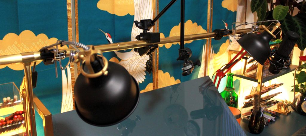
The solution I came up with was to create a light bar that spanned across the desk between the two shelf units. This is great because the surfaces remain free from objects, and the angle of light from above works really well for drawing and filming. I could also mount my main camera to this bar on a Manfrotto arm. Over-desk lighting/filming rigs are available on Amazon, but they didn’t quite fit what I wanted (or my budget!). Instead, I used a clothes rail, screw mounted to the shelves either side of my desk and wrapped in gold vinyl to match the desk frames. The lights themselves are clip lights, available for £25 each from Ikea, with 800 lumen white light bulbs from Amazon. The combination works well because the lights look the part and are still bright enough for drawing and filming.
For other filming around the studio I used a Neewar ring light on stand. It has a phone mount and is perfect for filming without disrupting the atmosphere or getting in the way.
Fitting Technology into the space
As an artist with a busy online presence, I knew technology would need to feature in the studio. The question is, how to fit it in seamlessly?
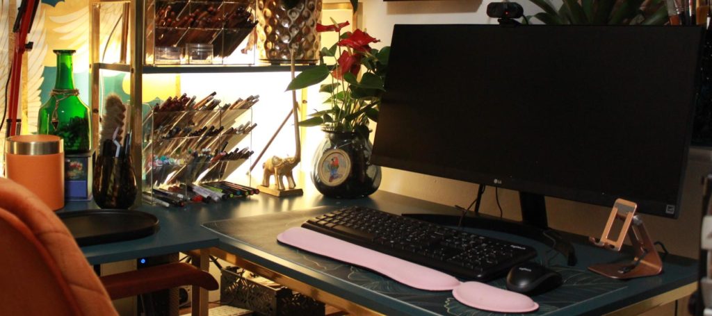
The first change I made was to swap my computer keyboard and mouse from white to black. Black has been a useful colour for things like this, it blends in to the background and is unobtrusive. The computer monitor is also black, so it works well.
When drawing and filming I use a combination of phones, cameras and a tablet. I knew from the start that I wanted these off the surfaces and easy to position wherever I wanted. The answer was a series of goose neck, clamp mounted stands. These can be positioned wherever I need them on the edge of desks, shelves, even the door and are rigid enough to hold the cameras still. The main over desk view is captured by a Canon EOS camera on a Manfrotto arm (positioned in the middle of that lighting bar).
As part of my art, I make a lot of videos, and record a lot of voiceovers. I use the Hyperx S Microphone, and bought a cherry red boom arm for it that mounts on the back of my drawing desk. This allows me to easily pull the mic down in front of my drawing area or computer area, without cluttering up any surfaces. The red arm is a great contrast to my teal desks and wall art, and holds the mic in position well.
Storage storage storage
As any artist will know, you quickly accumulate a lot of stuff. Materials, packaging, artworks and goodness knows what else piles up around you while you’re busy creating. This requires a practical approach to storage.
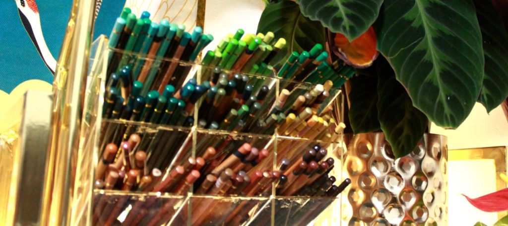
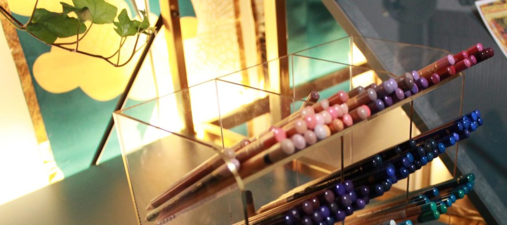
First and foremost, where to store my colour pencils. For years I have used wooden pencil drawers. They are good, but it was time for a change. I wanted something where the pencils could be the star of the show, visible and on display and easy to quickly access whilst I drew. When you have as many pencils as I do now, that isn’t easy to achieve. I opted for four of these Perspex pencil/pen holders. I keep the pencils and pens in the main sections and pan-pastels underneath. I love how the LED backlights shine through, illuminating the pencils. For added glamour, I added gold vinyl on the edges to replicate the look of brass and glass jewellery boxes, and I’m so pleased with how they turned out.
Underneath my desks, I have a series of large clear plastic storage boxes for odds and ends, paper and spare equipment. They are practical and slot underneath nicely. The desks have built-in shelves, which I’ve used for books, the computer and daily use stationery.
Decoration
My current home is a rented apartment in a new block in the city. For all its convenience, being a rental I was limited to what I could do to the space in terms of permanent decoration. For this reason I had to get inventive if I was going to create a maximalist space.
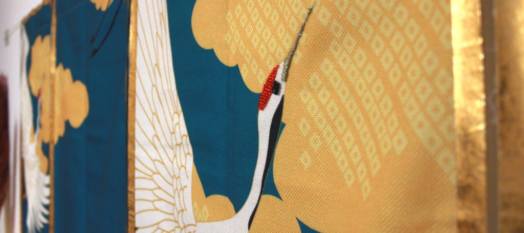
To give a splash of colour and pattern to the walls, I hung two sets of Noren curtains from a curtain wire attached to the wall via self-adhesive picture hooks. All totally removable and landlord friendly. The curtains act as wall hangings, and I chose to embellish them by creating a border of vintage gold washi tape and embroidery with bead work. This elevated the design beautifully and gave a point of detail to the eye.
I always feel like plants bring a space to life, and I didn’t want to miss out on the chance to fill the studio with a range of plants and flowers. The plants all came from Ikea, which made them great value! Included are a Bromelia for a splash of bold colour and structure, a sweet little pink Hyacinth – for a pink poodle shaped pot that it was just perfect for and a stunning large Calathea, which has deep green and purple leaves that feel velvety to the touch. Part of maximalism is texture, and the plants provide so much colour and texture to the space.
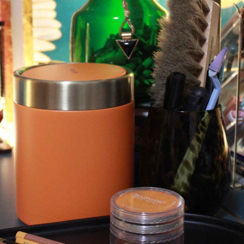
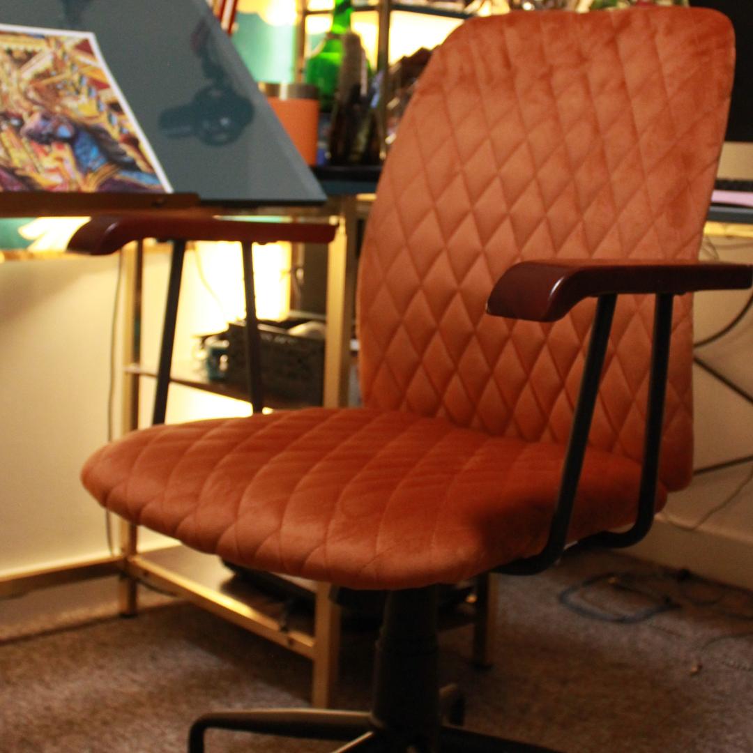
To finish the look I added a range of coloured glass planters and accessories. I love the way these reflect the light and introduce more colours to the scheme. The mini table bin, which I use for pencil sharpenings, gives a pop of bright orange and gold, which sets of the emerald green glass bottle behind it perfectly. I chose orange again when it came to the chair. The chair has good lumbar support and a quilted, velvety upholstery. The vintage style castors and dark wooden arms really set off the look. As a pencil artist I spend a lot of time in the chair, this one is both comfortable and ties the whole look together for me.
What does your dream art studio look like?
I hope this guide has given you some inspiration to create your own dream art studio. Whether you work from the dining table or you have a dedicated space, think about your studio in the same way you would an artwork and build something that inspires you to be a better artist. We all have our own unique sense of style, your studio is a great place to to express that, even if its by adding one or two new pieces.

